Entries Tagged 'copywriting' ↓
March 1st, 2013 — copywriter, copywriting, copywriting tips, marketing, online marketing, website copywriter, website copywriting, website design
Clarity – copywriting – images – scanable text – clear navigation – easy on the eye 
These are just a few things a successful website needs. Although the title of this blog post is ‘Engaging through web design’ it will delve deeper to look at the elements of a successful website, including web copy, layout and colour.
Let’s start at the beginning.
Plain English
When someone lands on your website (assuming they are English) their eyes will automatically be drawn to the top left and scan in a left to right motion, from top to bottom.
The first thing they’ll want to know is that they’ve arrived at the right place. That’s why your company name and strapline must be at the top of your website. After that there should be some well written words highlighting what you can do for them – yes, afraid so, this isn’t the place for a long essay on how great your company is.
It’s essential your opening gambit is powerful as this will determine whether the visitor will remain on your site to find out more, or navigate away to find another website.
But powerful doesn’t mean ridiculously complex words and sentences in an attempt to show your intelligence – it won’t.
What it will do is show you as a company that is far more interested in its own importance than it is it’s customers. That’s why you should always use plain and simple English to get your point across succinctly.
Clear navigation
The ability to easily navigate around your website is vital to enhance the user experience.
For example every website needs an “About Us” page so the user can learn a bit about the company they may be about to do business with. The name “About Us” fits this purpose perfectly. So why then do you find websites that use other, more obscure names for this page?
If you have a page that talks about your services, call it the “Services” page – it’s not rocket science.
By keeping your page names simple and obvious your visitors will be able to find their way around your website with ease – don’t make them hunt for information.
The other aspect of your navigation is to keep it to a minimum. There’s nothing more frustrating than landing on a website that’s full of hyperlinks – how will your visitor know where to click? Make sure your navigation is clear and simple to make moving around your website as intuitive as possible.
Readability
Earlier we mentioned the importance of using plain, simple English on your website, but you also need to make sure that it’s laid out in such a way that reading it is effortless.
The best way to achieve this is by including plenty of white space on your page. Taking this post as an example, you can see that I’ve used lots of short paragraphs and sub headings to help you, the reader, find the information you need.
The white space breaks up the text making it appear easier to digest. But it’s not just layout that you need to consider, colour also comes into play.
Have you noticed the number of websites these days that are using grey text on a white background? Yes, they look very modern, but for some readers this can pose problems because of the lack of contrast. Try and stick to high contrasts, like black on white, to make it easier for people of all ages to read what you have to say.
Prioritise your information
As with everything in life the most important stuff should come first.
When laying out your text, prioritise the order in which it will appear with the main benefits first leading on to the features and finally any other supporting information you have.
This will make sure the reader is hit with the important facts (the benefits) first, which will ultimately help them make their buying decision.
If you leave these until the end, you run the risk of losing them before they reach them.
As you can see, an effective website is a lot more than just an eye-catching design. Every aspect of your site, from its content to it’s images, layout and navigation, will have an impact on its success.
Take a few minutes out now to look at your website. Does it tick all the boxes, or is there room for improvement?
February 25th, 2013 — copywriter, copywriting, copywriting tips
Invisible writing? 
Let me explain.
The role of a copywriter is to write stonking copy that:
- Grabs the attention of the reader
- Persuades them that the product or service in question is what they’ve been looking for
- Convinces them to buy
- Compels them to get their wallet out and part with their hard earned cash
Plus, they have to do all that without being obvious about it.
Although copywriters write for a living, unlike the J K Rowlings, David Baldaccis and Scott Marianis of this world, their writing has to remain invisible – i.e. it shouldn’t be the reason for someone to stop and read.
Copywriters have a tough life – they are great at what they do and excellent writers, but they’ll never receive the recognition that our literary greats enjoy.
But the fact remains that the writing used to sell a product or service should do just that – sell. It shouldn’t be hailed for its literary merits, or be seen as the best-written piece since…well, the last best-written piece ever. It should just do its job without fanfare.
Writing with power
How do you achieve all of that?
The first stage is to picture your reader and write to them.
Yes, the actual audience you’re writing for will be more than just one in number and most probably quite varied, but by keeping one typical reader in mind you’ll be able to focus your writing on them and their needs.
The next stage is to develop an informal, conversational style of writing (in the second person). Write as though you’re having a chat with the reader over a coffee.
As you start to write always keep in mind the structure of a story. We’ve all grown up listening to them and so are predisposed to taking them in and believing them.
Once you have done your research into the company, product/service and audience you’re writing for, focus on the key benefits and shout about them. They are the lynchpin of your copy – they are the things that will convince the reader to buy what you’re selling.
By keeping your language and sentence structure simple and jargon free, you’ll be able to get your message across clearly. And following it up with a powerful call to action, you’ll have the reader eating out of your hand and reaching for their wallet.
Keep the reader in focus
As a copywriter, everything you write is about someone else; it’s never about you.
If you have a compelling urge to write great prose, my advice would be to write a novel. Keep your flamboyance for that and keep your copy clean, simple and every so quiet.
January 14th, 2013 — copywriting, copywriting tips
The following guest post was written by Dr Simon Raybould. The author’s views are entirely his own and may not reflect the views of FreelanceCopywritersBlog.com. If you are interested in producing a Guest Post for this blog, please get in touch with your ideas.
I’m a good writer – that is, I put a good choice of words in a good order. The result is something that says what I mean and means what I say.
Well, I like to think so. Other people might disagree.
As Coleridge once said (allegedly) “Prose, words in their best order. Poetry, the best words in the best order.” Which makes copywriting a form of poetry, I suppose. Perhaps we could define copywriting as ‘The best words in the best order to sell’. How does that sound?
If that’s the case, then I’d define presentations as the best words in the best order to explain and/or inform.
Now, as any professional presenter or presentation skills trainer will tell you, one of the best ways to get your message across in a presentation is not to use words at all – well, not lots of words on a screen, at least. Stories you tell out loud aren’t what I’m thinking of here.
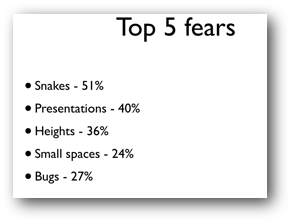
I’m thinking of the dreaded screen full of crap.
The bullet point deluge that carries enough ordnance to supply Camp Bastion for a week.
We know that slides with images and very view words work best (and by ‘we’ I mean those people who research into how to make good presentations and who teach people how to make good presentations!). The research evidence is that slides like this don’t work…

…when compared to slides like this…

Notice the lack of words?
Obviously, it’s not possible to get away with having no words on your slides all the time, so it becomes a question of what I pretend is the ultimate copywriting challenge – getting just one or two words to capture everything you want to say.
There are few fixed rules about how to do this, but I offer the following guide-lines, based upon experience of professionally appraising thousands of bad presentations (oh, God, the pain! Those are hours of my life I can never get back!).
Sentences are a mistake in slides (unless you’re quoting someone like Einstein, in which case have the courtesy to quote him in full). This is because a sentence takes too much processing. Phrases are better. Now obviously I’m over simplifying here, because a sentence can have just one word in it: “Run!” is a perfectly formed sentence, but you know what I mean.
A full sentence is a closed concept – it doesn’t pro-actively engage a member of the audience who reads it on your slides because all the work has been done for them by you. You can absorb sentences passively. Presentations are not books – or pamphlets or whatever…
Phrases are better. Grammar be damned – it’s all about effect, not keeping your company’s grammar police happy (hello Clare! I love you really.). “Ensure you have an uptake level above the required thresholds” is dull, closed sentence, compared to “Uptake targets”.
Besides, it takes a lot less time to read just two words – which means your audience’s attention will be pulled back to you (and you’re interesting, remember!) in much less time.
Passivity is a mistake (in slides, at least). Okay, to be completely honest, if you have so few words that you’re down to single words or pairs of words (a verb and an adjective) such as “Work harder”, then it’s hard to worry about whether your words are in the active or the passive voice… but if you’ve got a choice, the active voice is better.
Let’s fact it, who wants to “Receive instructions” when they can “Grab the facts”?
Finally…
Explanations are a mistake. What I mean by this is that if you’ve got to explain what you mean, what you’re writing is too complicated (for a slide). See what I’ve done there?
To be really effective, your slides should engage your audience immediately. Audiences don’t like working hard to understand slides: they don’t mind working hard to understand your message, of course (sometimes) but the slides themselves need to be simple so that the audience can grab ‘em immediately.
An analogy I used for my second book was ‘like a brick wrapped in velvet’. The message – your brick – can be as hard hitting and difficult as you like but you need to wrap it in something that audiences can get hold of easily – such as velvet – if you want them to pick up your brick.
(Yes, yes, it’s a rubbish analogy but I was a young man when I wrote that book!)
In short, you should never need to say something twice, in a different way. If you do, your original explanation wasn’t clear enough.
In other words, you shouldn’t need to do what I’ve just done!
Author’s bio:
Dr Simon Raybould is one of the UK’s foremost presentation skills trainers (see http://www.curved-vision.co.uk to see how he and his company can help you). He’s also a professional speaker in the area of resilience, emotional robustness, confidence and happiness. (See http://www.divventpanic.info).
He lives in Newcastle, with his wife and two children (when they want something) and is a reasonably proficient fire-eater!
January 11th, 2013 — copywriting
Isn’t it incredible how the English language continues to evolve.
Watching costume dramas always brings a smile to my face as the actors try and navigate their way through the archaic and stilted language of the period being depicted. It’s whilst chortling quietly to myself that I realise how much our language has changed and continues to do so.
That’s why I wanted to share with you the 12 words that Collins Dictionary claims to have played the greatest role in defining the character of the year (courtesy of The Drum)
- Broga – yoga for men
- Legbomb -Angelina Jolie’s red carpet pose
- Eurogeddon -Eurozone economic crisis
- Mummy porn – inspired by 50 Shades of Grey
- Zuckered – Facebook share price plummet
- Jubilympics – combination of the Queen’s Jubilee and the Olympics
- Romneyshambles – when Mitt Romney’s UK visit didn’t go as planned
- Games Makers – the Olympic volunteers
- 47 per cent – the people Romney castigated in the US election
- Superstorm – storm just below hurricane strength
- Gangnam Style – the South Korean pop song
- Fiscal Cliff – US tax hikes and spending cuts for 2013
Can you think of any more?
What recent addition to the English language makes you smile, cringe or roll on the floor with laughter? Tell us by leaving a comment below.
December 28th, 2012 — copywriting, copywriting tips, direct mail campaign, effective copy
Ask any professional copywriter and they’ll tell you the power of persuasion lies within the copy of any piece of marketing material. Ask any designer and they’ll tell you it is the eye-catching design that will sway the reader.
So who’s right?
Well in a way they both are. Let me explain.
Your audience wants to be seduced; they want to be wooed by high quality sales messages that are not only engaging when read, but that also look the business.
Let’s face it, a glossy mailing that arouses curiosity is more likely to be read than a folded piece of A4 paper covered in Courier font that’s splattered with italics, bold words and underlining.
Admittedly, these letters do work in some markets, but personally I can’t stand the things and always launch them bin-wards when they arrive through my door (or if it’s on a website I navigate away faster than a fast thing).
But there’s no getting away from the fact that a quality mailing will give a better return.
Words and design go hand in hand
The main trick for any mailing is to ensure the copy and the design marry. For example, if you send out an elegant flyer that’s accompanied by text that’s very informal and more akin to something you’d expect to find in a text message (extreme example), it won’t work.
Or will it?
Perhaps that sort of disparity would work – it would certainly get your mailing noticed and talked about.
And, after all, that’s what it’s all about isn’t it? Getting noticed?
There’s a challenge for someone – to come up with an elegant ‘up market’ style flyer that contains text-speak language. I’d love to see the results.
The same goes for copy.
Why are there so many people out there who feel the desperate need to flag up the tiniest of errors just because they can? No one is perfect (nope, not even me) and errors do happen.
But there are some copywriters who will even – shock horror – make spelling or grammatical errors on purpose.
A well-placed typo can bring attention to a key point; flouting the rules of grammar can have the same effect – after all, rules are there to be broken aren’t they? And people have been breaking grammatical rules for centuries.
Of course there is a huge difference between a well-placed faux pas and an ignorant and careless mistake.
Your reputation in your hands
What it comes down to is your mailing, or whatever form of marketing you care to mention, holds the key to your customers’ perception of your company.
It’s human nature to judge ‘a book by its cover’ (please excuse the cliché) and however hard you try not to, you won’t be able to help yourself.
So one sloppy mistake, one misjudged mailing, one ill written letter, will tarnish your business forever (well, for quite a while anyway).


