What is the one thing that will get your website visitors buying?
No, I’m not talking about your services or products (although they do help), what I mean are the words on your site.
Pretty images and a flashy high-tech website will only go so far; if the words on your website, or more importantly the way they appear, aren’t clear no one will hang around to buy.
In the past I’ve looked at the importance of your website copy and why it should be full of benefits rather than features, but this post is more concerned with a different aspect of copywriting: the physical writing itself.
Get your message read
In a simple world, someone lands on your website, reads your text, thinks ‘that’s for me’ and buys.
Well, the world isn’t simple and that’s not how it works.
There are several barriers that could stand between you and securing a buying visitor. And I’m not talking about cost or anything like that (although valid barriers), what I mean is the text on your site.
Font size
If someone lands on your site and sees teeny tiny text that they can’t read even with their face presses up against their screen, they’re no going to buy.
But if they’re greeted by a font size that is clear and highly readable, they will continue along the sales process.
Font colour
Black text on a white background is probably the best combination you can have.
White text on a black background isn’t too bad, but can be tricky for some.
But very pale colours on a white background or dark colours on a dark background will be a complete turn off as your reader will have to go and lie down in a darkened room to recover from eye strain.
So think carefully before you decide on your design theme.
Type of font
Your choice of font will also have an impact on the impression you’ll give your visitors.
Most companies opt for something like this font; it’s simple, easy to read and looks professional.
But please, please, please avoid the dreaded Comic Sans font, you may think it shows your playful side, but it doesn’t. It’s just very annoying and makes you look like a. …[you can fill in the blank].
Spacing
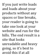
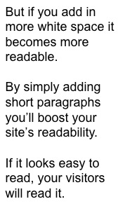
The way you lay out your text is also important.
So you see, there’s a lot to think about even before you actually get down to the nuts and bolts of what you’re going to write about.
If you, at all times, have your reader in the forefront of your mind, you won’t go far wrong. Make sure:
• Your text is the right size
• Think carefully about colours and contrasts
• Choose your font wisely
• Keep lots of white space on your page.


1 comment so far ↓
[…] Learn more about text that converts at Sally Ormond’s site Filed Under: Uncategorized […]
Leave a Comment